The `layout` attribute describes what the app will look like
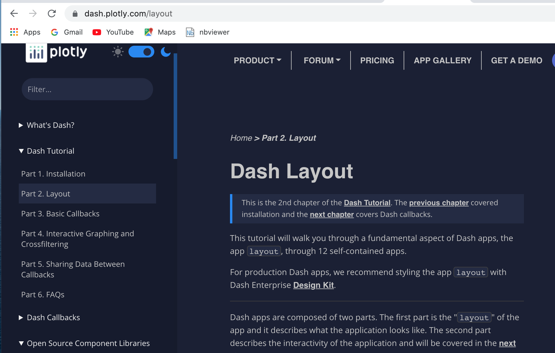
See dash.plotly.com/layout which is chapter 2 of the Dash Tutorial.
The Dash layout attribute describes what the app will look like.
It is made up of a set of declarative Dash components and is a hierarchical tree of components.
(My notes here are mainly based on the Dash Layout section of the tutorial at https://dash.plotly.com).
- The App Layout describes what the application looks like, the front-end of the app. It usually includes a container element
html.Div which takes a list of components for its children parameter.
Child components are displayed in the order that they are written when the app is rendered.
This is the example from part 2 of the tutorial.
app.layout = html.Div(children=[
    html.H1(children='Hello Dash'),

    html.Div(children='''
        Dash: A web application framework for Python.
    '''),

    dcc.Graph(
        id='example-graph',
        figure=fig
    )
])
-
The layout is composed of a tree of “components” like html.Div and dcc.Graph in the example above.
-
The dash_html_components library has a component for every HTML tag.
- A class is provided for every HTML tag
- Keyword attibutes describe HTML attributes such as
style, className and id.
-
The dash_core_components generates higher-level components like controsl and graphs. It describe higher-level components that are interactive and are generated with JavaScript, HTML, and CSS through the React.js library.
-
Each component is described entirely through keyword attributes. Dash is declarative.
-
The children property is a special one. By convention it is the first and main attribute and therefore can be omitted. It can contain a string, a number, a single component or a list of components. It is the main container of the content of the component.
-
CSS style sheets can be used to modify the default style of elements.
-
The Dash Bootstrap Components is a third-party component library that can be used with Plotly Dash.
dash-bootstrap-components is a library of Bootstrap components for Plotly Dash, that makes it easier to build consistently styled apps with complex, responsive layouts. https://dash-bootstrap-components.opensource.faculty.ai/.
There are a few differences between dash_html_components and the HTML attributes.
* The HTML `style` property is a semicolon-separated string but in Dash you supply a Python dictionary. The keys in the style dictionary are camelCased.
* The HTML `class` attribute is `className` in Dash.
* The children of the HTML tag is specified through the `children` keyword argument.
* All of the available HTML attributes and tags are available within your Python context.
The HTML components are implemented as Python classes so they follow Python’s convention of capitalising class names. For example html.P, html.H1 , html.Div etc.
Hot-reloading
Dash (from 0.30) includes “hot-reloading” when you run the app with app.run_server(debug=True). Dash automatically refreshes the browser when a change is made to the code.
Reusable components
By writing our markup in Python, we can create complex reusable components like tables without switching contexts or languages.
See https://dash.plotly.com/layout of the tutorial.
More about visualisation.
The dash_core_components library includes a Graph component which renders interactive data visualisations using the open-source plotly.js JavaScript graphing library. (Plotly.js supports over 35 chart types rendering charts in both SVG and WebGL.).
The figure argument in dcc.Graph is the same as that used by plotly.py (where plotly.py` is Plotly’s open-source Python graphing library).
The graphs are interactive and responsive where you can hover over points to see values, click on legends to toggle traces, zoom and pan etc.
Markdown
Blocks of text can be written using the Markdown component of the dash_core_components library
Customising the appearance of a Dash app
See FAQs of the Dash Tutorial.
Dash apps are rendered in the browser as modern standards-compliant web apps and therefore CSS can be used to style a Dash app as you can with standard HTML.
All dash-html-components support inline styling through a style attribute.
An external stylesheet can also be used to style dash-html-components and dash-core-components using the ID or class names of the components.
(the className attribute corresponds to the HTML element class.
See the Dash HTML components section of the dash User Guide.
JavaScript scripts can be added in the same way as to other HTML documents.
See Adding CSS & JS and Overriding the Page-Load Template of the user guide.
Dash Bootstrap Components can be used to style the theme of an app.
Provide the name of a theme as a external_style_sheets parameter.
Making the theme of the app consistent with the theme of the charts
The theme of the app can also be made consistent with the theme of the charts by using the same default background colours that are used in Plotly’s figures. To do this you use the style parameter in the top-level html.Div of the app.
Plotly’s Figure object has two main areas:
- The “plot” area which is the inner rectangle within the x and y axes
- The “paper” area which is the outer rectangle enclosing the “plot” area
The Dash Core Components Graph component has a Figure attribute to which you can add a Figure with your chosen background colours. This will replace the empty figure with a white background which appears when the app is run and before any values have been selected.
Notebook following part 2 of the Layout tutorial
References
- Dash Python User Guide
- Dash Layout section of https://dash.plotly.com/ tutorial
- Dash Core Components gallery
- [Dash HTML Components gallery]https://dash.plotly.com/dash-html-components()

See dash.plotly.com/layout which is chapter 2 of the Dash Tutorial.
The Dash layout attribute describes what the app will look like.
It is made up of a set of declarative Dash components and is a hierarchical tree of components.
(My notes here are mainly based on the Dash Layout section of the tutorial at https://dash.plotly.com).
- The App Layout describes what the application looks like, the front-end of the app. It usually includes a container element
html.Divwhich takes a list of components for itschildrenparameter.
Child components are displayed in the order that they are written when the app is rendered.
This is the example from part 2 of the tutorial.
app.layout = html.Div(children=[
html.H1(children='Hello Dash'),
html.Div(children='''
Dash: A web application framework for Python.
'''),
dcc.Graph(
id='example-graph',
figure=fig
)
])
-
The layout is composed of a tree of “components” like
html.Divanddcc.Graphin the example above. -
The
dash_html_componentslibrary has a component for every HTML tag.- A class is provided for every HTML tag
- Keyword attibutes describe HTML attributes such as
style,classNameandid.
-
The
dash_core_componentsgenerates higher-level components like controsl and graphs. It describe higher-level components that are interactive and are generated with JavaScript, HTML, and CSS through the React.js library. -
Each component is described entirely through keyword attributes. Dash is declarative.
-
The
childrenproperty is a special one. By convention it is the first and main attribute and therefore can be omitted. It can contain a string, a number, a single component or a list of components. It is the main container of the content of the component. -
CSS style sheets can be used to modify the default style of elements.
-
The Dash Bootstrap Components is a third-party component library that can be used with Plotly Dash.
dash-bootstrap-componentsis a library of Bootstrap components for Plotly Dash, that makes it easier to build consistently styled apps with complex, responsive layouts. https://dash-bootstrap-components.opensource.faculty.ai/.
There are a few differences between dash_html_components and the HTML attributes.
* The HTML `style` property is a semicolon-separated string but in Dash you supply a Python dictionary. The keys in the style dictionary are camelCased.
* The HTML `class` attribute is `className` in Dash.
* The children of the HTML tag is specified through the `children` keyword argument.
* All of the available HTML attributes and tags are available within your Python context.
The HTML components are implemented as Python classes so they follow Python’s convention of capitalising class names. For example html.P, html.H1 , html.Div etc.
Hot-reloading
Dash (from 0.30) includes “hot-reloading” when you run the app with app.run_server(debug=True). Dash automatically refreshes the browser when a change is made to the code.
Reusable components
By writing our markup in Python, we can create complex reusable components like tables without switching contexts or languages. See https://dash.plotly.com/layout of the tutorial.
More about visualisation.
The dash_core_components library includes a Graph component which renders interactive data visualisations using the open-source plotly.js JavaScript graphing library. (Plotly.js supports over 35 chart types rendering charts in both SVG and WebGL.).
The figure argument in dcc.Graph is the same as that used by plotly.py (where plotly.py` is Plotly’s open-source Python graphing library).
The graphs are interactive and responsive where you can hover over points to see values, click on legends to toggle traces, zoom and pan etc.
Markdown
Blocks of text can be written using the Markdown component of the dash_core_components library
Customising the appearance of a Dash app
See FAQs of the Dash Tutorial.
Dash apps are rendered in the browser as modern standards-compliant web apps and therefore CSS can be used to style a Dash app as you can with standard HTML.
All dash-html-components support inline styling through a style attribute.
An external stylesheet can also be used to style dash-html-components and dash-core-components using the ID or class names of the components.
(the className attribute corresponds to the HTML element class.
See the Dash HTML components section of the dash User Guide.
JavaScript scripts can be added in the same way as to other HTML documents. See Adding CSS & JS and Overriding the Page-Load Template of the user guide.
Dash Bootstrap Components can be used to style the theme of an app.
Provide the name of a theme as a external_style_sheets parameter.
Making the theme of the app consistent with the theme of the charts
The theme of the app can also be made consistent with the theme of the charts by using the same default background colours that are used in Plotly’s figures. To do this you use the style parameter in the top-level html.Div of the app.
Plotly’s Figure object has two main areas:
- The “plot” area which is the inner rectangle within the x and y axes
- The “paper” area which is the outer rectangle enclosing the “plot” area
The Dash Core Components Graph component has a Figure attribute to which you can add a Figure with your chosen background colours. This will replace the empty figure with a white background which appears when the app is run and before any values have been selected.
Notebook following part 2 of the Layout tutorial
References
- Dash Python User Guide
- Dash Layout section of https://dash.plotly.com/ tutorial
- Dash Core Components gallery
- [Dash HTML Components gallery]https://dash.plotly.com/dash-html-components()
