Matplotlib
By Angela C
March 3, 2021
Reading time: 8 minutes.
Just some notes on using the Matplotlib plotting library based on the documentation, tutorials etc at https://matplotlib.org.
matplotlib is a comprehensive library for creating static, animated, and interactive visualizations in Python. There is a comprehensive website with a documentation, examples, tutorials and more. Matplotlib is highly customisable. It is very useful for performing exploratory data analysis on a dataset. While you can create some interactive plots with Matplotlib, it is mainly used for static plots.
The Matplotlib Usage Guide tutorial covers some basic usage patterns and best practices.
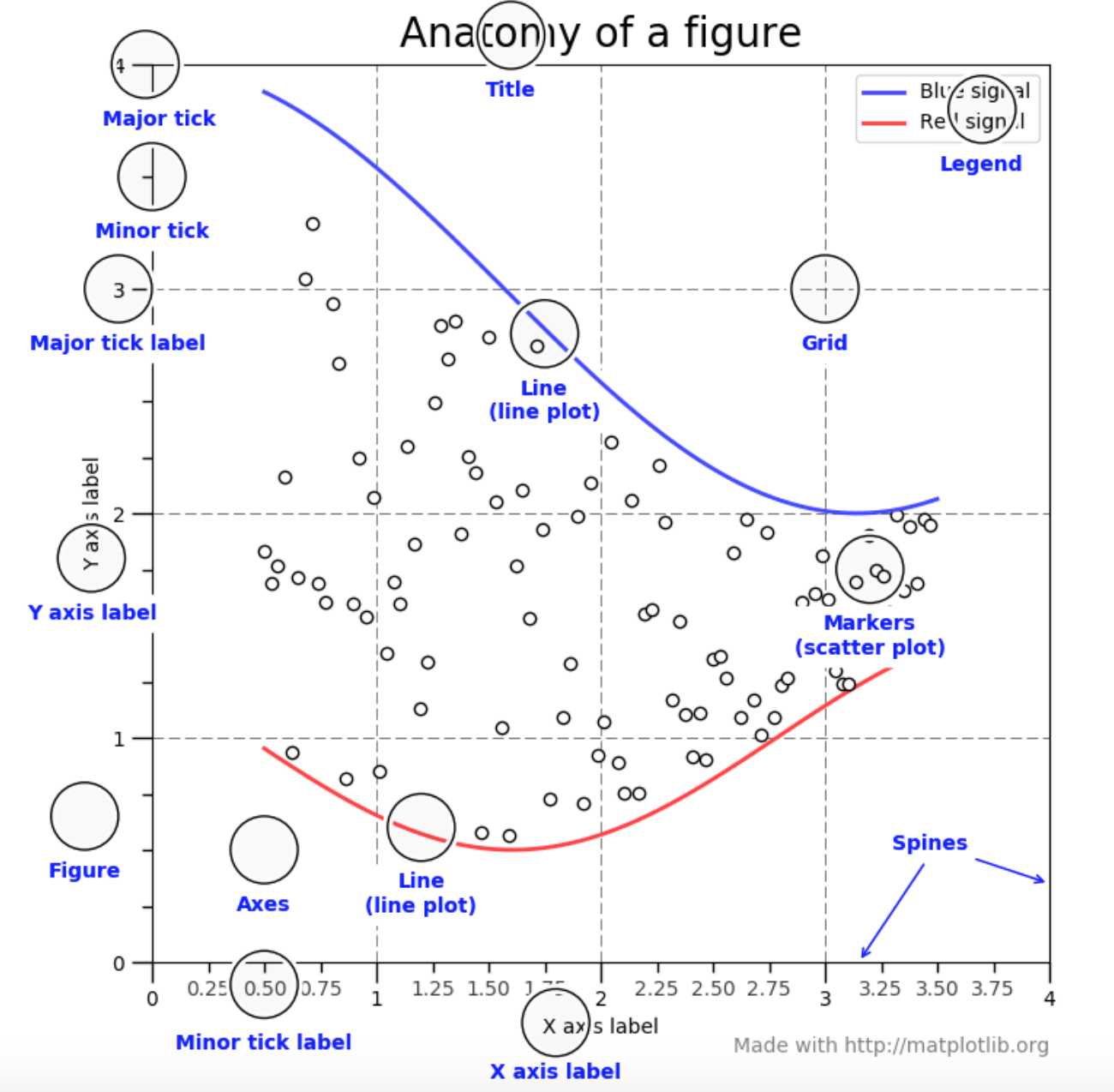
Matplotlib graphs data onto Figures which is the top-level container of all the plot elements. The Figure is at the very top of a hierarchy of objects and contains other elements of the plot including Axes, Labels, Ticks and Legends. Every single element can be customised.
Figure parameters that can be customised include:
figsizefor the width and height of the figure (in inches)dpiDots per inchfacecolorandedgecolorlinewidthof the framesubplotparsfor the Subplot parameterstight_layoutandconstrained_layoutfor padding between subplots.
Plots are based on figures. A Figure is a whole window or canvas that can hold a single or multiple plots.
The Axes is what can be thought of as a plot, the region of the image with the data space. A figure can contain many Axes but a given Axes object can only belong to one Figure. The Axes contain two (or 3 for 3D) Axis objects which take care of the data limits and generating the ticks and ticklabels. Each Axes has a title, x-label and y-label. (There is a difference in matplotlib between the Axes and the usual term axes as the multiple of axis).
The
[Axes](https://matplotlib.org/stable/tutorials/introductory/usage.html#axes)class and its member functions are the primary entry point to working with the OO interface.
Multiple plots in a single figure are known as subplots.
Within the figure various elements such as Axes, Lines and Markers can be created. You can also change the aspects such as size and angle of the ticks, position of legends, colour and thickness of lines etc.
- Axes: plots have X and Y axes with one variable on the x-axis and another on the y-axis.
- Legends: information on what the symbols in the plot represent
- Ticks: small lines to point to different regions of the graph or mark different thresholds. Ticks go along the sides and the bottom of the graph.
- Grids: lines in the background of the plot to make it easier to see where the X and Y values intersect.
- Lines/Markers: represent the actual data on the plot.
The following image from the Usage Guide tutorial points out the various components of a figure.
The Pyplot interface.
The Pyplot tutorial is an introduction to the pyplot interface which uses MATLAB-like commands.
The
pyplotAPI is generally less-flexible than the object-oriented API. Most of the function calls you see here can also be called as methods from an Axes object.
matplotlib.pyplot is a collection of functions that make matplotlib work like MATLAB. Each
pyplotfunction makes some change to a figure: e.g., creates a figure, creates a plotting area in a figure, plots some lines in a plotting area, decorates the plot with labels, etc.
Visualisations can be created using a series of presets or by creating the figures and axes to plot the data on yourself.
First import matplotlib.pyplot to import the pyplot module. Once this is imported it is quite easy to call a number of it’s different plotting functions and pass in the dataset to be visualised
-
plt.plot()to create a simple plot. The first set of numbers provided to the function will be used as the x-axis values and the second set as the y-axis values. If only a single series of numbers is provided these will be used as the x-axis values and default values will be used for the y-axis. -
The colour and style of the symbol to be used can be passed as the third argument
-
plt.plot()constructs the plot with it’s elements.
There are several style commands including:
- color such as r for red, b for blue, g for green
- -- for dashes, ^ for triangles, s for squares, o for circles, . for dots etc
- colour and symbol can be combined gs for green circles, ro for red circles etc
Example: plt plot([1,2,3,4], [3,5,7,9], 'ro)
plt.bar()for a bar chart.plt.bar(['A','B','C','D'], [10,15,23,45])plt.barhfor a horizontal bar chart- can add error bars to a bar chart using the
xerrandyerrarguments plt.piefor a pie chart. Can use theexplodeargument to offset a wedge of the pie from the centreplt.show()displays the plot when the code is run
Figure objects
A figure object is created by default by Matplotlib. However the figure() function allows you more control over how the plot is created.
-
can specify the dimensions of the figure by passing in a list with 4 values between 0 and 1.
- The four numbers are in the order left, bottom, width, height.
-
The
add_subplot()function can also be used to specify the dimensions.
Axes
Axes objects sit within the figure and allow you to control how individual subplots are displays on the axes.
A figure holds axes; every axes object can store its own plots.
An Axes instance contains most of the elements of a Figure such as ticks, lines, text etc.
- A Figure can have multiple Axes
import matplotlib.pyplot as plt
fig = plt.figure()
ax = fig.add_axes([0,0,1,1])
names = ['A','B','C','D']
values =[5,12,23,4]
ax.bar(names, values)
plt.show()
fig.add_axesfunction returns a new Axes objectax.- Can add elements using the
axobject. ax.bar()(instead ofplt.bar())
- Can add elements using the
- The axes object
axbelongs to the figure objectfigso everything added tofigwill also be added toax.fig.add_axes([0,0,1,1])specify the left, bottom, width and height.- The numbers refer to the section or fraction of the figure the Axes object belongs to
- The first 2 numbers
0,0means to start at left bottom - the second two numbers
1,1means to have the same width and height as the parent figure.
fig.delaxes(ax)to delete an axes.
Subplots
-
create multiple plots within the same figure
-
create a
subplotfor each plot in the figure -
add_subplot()function:- the first number refers to the number of rows to add to the figure
- the second number refers to the number of columns
- third number refers to the number of plots to add
add_subplot(111)adds one new subplotadd_subplot(221)to add two columns, two rows so four axes. The1refers to the first subplot.
-
Can change the Figure size
- pass a
figsizeargument tofigure()function. figsizeargument can also be passed to thesubplots()function.- figsize is set in inches
- pass a
-
Specify the title using either
set_title()function or passing the title argument to theset()function. -
Use the
suptitle()function to add titles to a Figure object -
xlabel()andylabel()functions to label the x and y axes. -
can also use the
set()function on the axes object orax.set_xlabel()andax.set_ylabel()to set the labels individually. -
Change the scale to a non-linear scale:
- using
xscale()andyscale()functions - provide the functions with the type of scale such as log scale
log.
- using
-
Adjust legend position using
legendwith thelocsuch as “upper right”. -
Add text to a plot using
textfunction to write directly on the axes object. -
Edit the position and labels of the ticks of the plot using
set_xticksorset_yticks -
then
set_xlabels()andset_ylabels()to label the ticks. -
To customise a single subplot use the
sca()method and pass it a list of axes objects and specify which subplot to use, for example:plt.sca(axes[1,1]) -
Change tick frequency. The frequency of ticks is set automatically based on the data but it can be changed on a figure-level or an axis-level.
-
The tick frequency on a Figure level with multiple axes will be uniform and apply to all the subplots.
xticks()andyticks()functions with an array of values to start and end with, and a step size. -
For multiple plots on the same figure change the ticks on the axis-level.
- use
set_xticks()andset_yticks()functions on the axes objects when adding subplots to a Figure. Then change the ticks of the subplots separately.
- use
-
-
Set Axis Range
- can change the range of data that is shown on a figure or axes. This can be used to truncate the view to only show the data in a particular range as defined with
xlimorylimwhich take a tuple for the limits. - Can set the axis range using both the PyPlot and the Axes instances
plt.xlim([10,30])using the PyPlot instanceax2.set_xlim([10,30])to set the limit for one of several axes instances.- similarly using
plt.ylimorax2.set_ylim()to se the Y limits.
- can change the range of data that is shown on a figure or axes. This can be used to truncate the view to only show the data in a particular range as defined with
-
Layouts
tight_layout()to remove excess white space between subplots. Ensures the elements fit tightly within the figure and look good.subplots_adjust()to set the parameters between subplots.
-
- There are many colours supported by Matplotlib that can be used to change the colour of elements.
- The base colours can be referenced by a letter such as
rfor red orgfor green. - The base colours are
rfor red,bfor black,ggreen,ccyan,mmagenta,yyellow,kblack andwwhite. - There are other colours which can be specified by name
- Hex or RGB or RGBA codes can also be used.